DESIGN JUSTIFICATION
Logo
Circumferences, rounded shapes, and curved lines are the inspiration behind the Team IUD logo.
There are four lines inside the circle, as there are four members in the team. The lines are arranged to mimic the ‘T- shape’ of an IUD. The upper two lines are curved to convey not only the shape of the technology but the harmony of smiling eyes in a face.
The two colors used are consistent with our color palette: cream beige and opaque rose.


Website Layout
Our WordPress theme is Idyllic by Theme Freesia. Predominantly for its easy to read and use layout, we chose Idyllic for its simplistic style. We activated the Elementor plug-in as a visual customization and design tool to add text, headings, links, icons, and photos.
To align with our color palette, we customized Idyllic by editing the stylesheet code transforming all red accents like hyperlinks, highlights, and hovers, to our branded magenta. We also edited the Theme Footer to include our disclaimer that this site is not affiliated with Mirena or Bayer.
Poster Layout
Circumferences, rounded shapes, and curved lines are also the inspiration behind the Mirena IUD poster. The epicenter of the project is the technology itself, located at the upper-left corner. Everything else emanates from it in a radius and stays related to it visually.
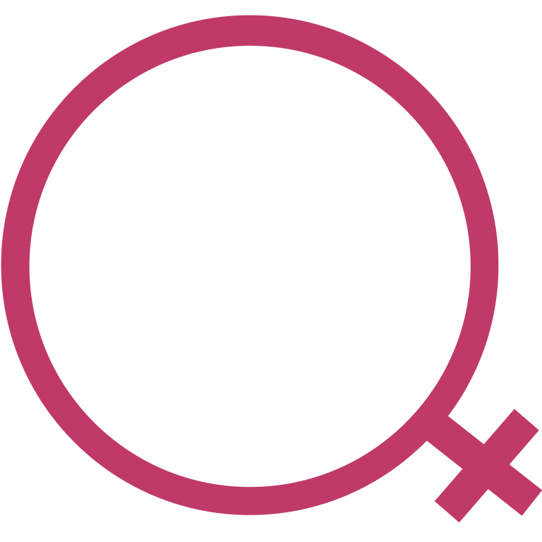
Starting with the women’s symbol surrounding the device, the gaze is directed toward the architecture and nudged toward the other subsequent sections. The larger circle which surrounds the women’s symbol is divided in three sections, to symbolize the idea of a cycle in relation to the human body and women’s menstrual cycle.
On the upper-right side of the poster, the title and the focus of this research project is stated. We focused on not only how Mirena works, but the impact Mirena and birth control has had on the socio-technical system it belongs to. This information has its own visual focus but it’s also slightly shaped in a curve in relation to the bigger circle of the technology, as are the other sections in the poster.

Color Palette
We decided on a batch of ten colors with varying shades to present the information on both our website and poster. The shades go from magenta to gray, with variations in between. Bright and opaque pinks, in addition to purples, are related to the traditional feminine colors. In addition, light beiges and grays convey calmness, softness, and subtlety, which was an important aspect to our design as we were trying to visually portray a sensitive subject.
Women’s Symbol in Magenta
The women’s symbol is set on the upper-left corner of the poster, with the cross pointing and directing the attention towards the other sections. Magenta was used for the symbol to make it stand out against a palette of creme and pastel colors. In addition to that, in 2014, UN Women worked with Pantone Color Institute to define a color for the symbol of their campaign #HeForShe and selected Magenta: “In the magenta family, pink radiates youthfulness and energy and redder hues voice a call to action. Bright and bold, HeForShe Magenta unites both ends of this spectrum – the ideal color to represent the solidarity movement for gender equality” (He For She, 2016).


Fonts
The Helvetica font family was used as a simple, easy to read font for our website, videos, and poster. Futura and SignPainter were each uniquely used to emphasize headings and subheadings throughout our poster.
Sources
He For She. 2016. “Our Mission.” UN Women. http://www.heforshe.org/en/our-mission
